Years ago, Stacy and I frequented an Italian restaurant tucked into the flank of a non-descript strip mall. The food was obvious but delicious, and the music was the kind of non-offensive but cacophonous jazz that I know I'm supposed to like. After years of buttered scallops, gnocchi and Chianti, I started developing a Pavlovian response to the music. To this day, background jazz playing at the vet, the auto repair shop (cool cats, those guys), or the Post Office prompts an instant and irrational desire for focaccia and olive oil.
Similarly, the sight of a crumpled napkin or envelope and a well nibbled pencil inspires me to draw landscapes. This is always the origin of any of my landscape designs. It's a relaxed place without mistakes, expectations or a fixed destination. It's fun.
My nine year old introduced me to a perfect word to describe this process: adumbrate. It's similar to foreshadow without the spooky or negative connotations.
So, enough adumbration already! Let's jump into what this post is about: early-in-the process sketches of some of our landscape projects.
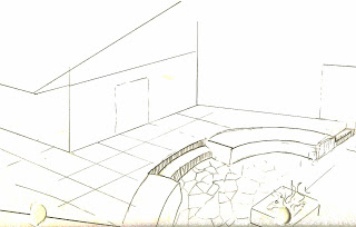
Thumbnail sketches are a great way to contrast and compare disparate surface materials as well as reconciling elevations. With this illustration, I was exploring ways of transitioning from the formal granite surface of the upper patio to the informal stone patio and fire feature below it.
The simplest lines can capture the essence of an idea: a wall-mounted recirculating water feature to psychologically enclose a patio.
More elaborate sketches can help refine the architectural style of the hardscape and how it relates to the topography of the site.
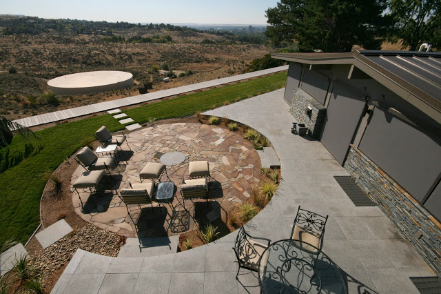
This is typical of the built out version of a sketch: less elaborate with cleaner lines.

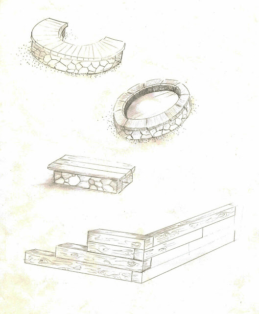
A few months back I completed a series of exploratory sketches to try out different ideas for a bocce court construction project.
Here's another case of uber-simplification in the build out. We stuck with the timber frame for the bocce court, but jettisoned the stacked ends. We also cut out the benches and firepit but used the drystack andesite for terracing and to delineate rooms and corridors within the new garden space.
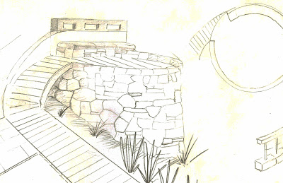
I sketched this out to understand the slope of the site. I envisioned the wall emerging out of the slope as if it had been recently excavated in an archeological dig.
Once the ground thaws, we'll partially cover up the back side to create the "hey this has been here all along" charade, but let's just keep that secret between us, okay?
The next stage in this same project will be the construction of a three level patio space that will be the heart of the landscape.
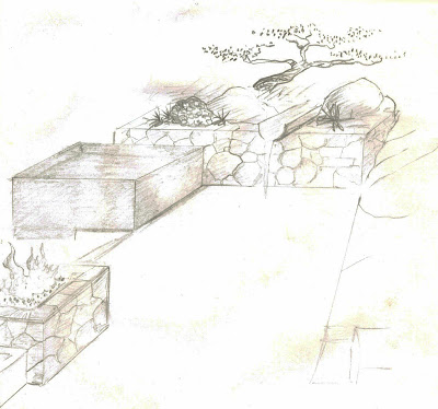
The upper portion of the patio (a formal outdoor dining space) will contain a drystack fire cube, a zero-edge spa, and a raised planting bed and water feature.
Working through a series of sketches was critical in understanding how all these components will ultimately relate to each other.
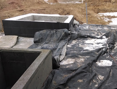
The zero-edge spa and planter are complete, but the ground needs to thaw a bit for the flatwork and rock work to begin...
Until then, I draw.
 |
| Nature hath no muse equal to thy crumpled splendor. |
My nine year old introduced me to a perfect word to describe this process: adumbrate. It's similar to foreshadow without the spooky or negative connotations.
So, enough adumbration already! Let's jump into what this post is about: early-in-the process sketches of some of our landscape projects.
Thumbnail sketches are a great way to contrast and compare disparate surface materials as well as reconciling elevations. With this illustration, I was exploring ways of transitioning from the formal granite surface of the upper patio to the informal stone patio and fire feature below it.
The simplest lines can capture the essence of an idea: a wall-mounted recirculating water feature to psychologically enclose a patio.
More elaborate sketches can help refine the architectural style of the hardscape and how it relates to the topography of the site.
This is typical of the built out version of a sketch: less elaborate with cleaner lines.

A few months back I completed a series of exploratory sketches to try out different ideas for a bocce court construction project.
Here's another case of uber-simplification in the build out. We stuck with the timber frame for the bocce court, but jettisoned the stacked ends. We also cut out the benches and firepit but used the drystack andesite for terracing and to delineate rooms and corridors within the new garden space.
I sketched this out to understand the slope of the site. I envisioned the wall emerging out of the slope as if it had been recently excavated in an archeological dig.
Once the ground thaws, we'll partially cover up the back side to create the "hey this has been here all along" charade, but let's just keep that secret between us, okay?
The next stage in this same project will be the construction of a three level patio space that will be the heart of the landscape.
The upper portion of the patio (a formal outdoor dining space) will contain a drystack fire cube, a zero-edge spa, and a raised planting bed and water feature.
Working through a series of sketches was critical in understanding how all these components will ultimately relate to each other.
The zero-edge spa and planter are complete, but the ground needs to thaw a bit for the flatwork and rock work to begin...
Until then, I draw.

